MARKETING EMAIL
Learn to design great marketing emails for your eCommerce store. We have incorporated well thought out design patterns and best practices in these email ideas.
Design for ‘Images Off’
Sona
|
Marketing Email
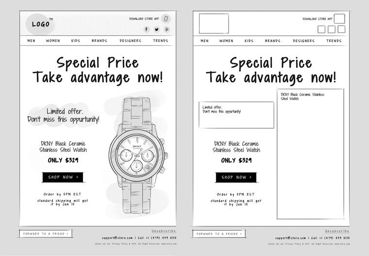
Most email clients disable images automatically in their inbox. Hence, recipients usually won’t get to see the images in their emails unless they take the pain of clicking ‘view the image’. While designing an email think of how it might look if the images aren’t displayed, to ensure your email conveys the right message even when images are turned off
Try not to use too many images
Have enough text to balance your images
Use HTML buttons instead of image based buttons for your primary cta
Don’t embed your offer/s in an image
Specify image height and width tags so that the position of text and other elements of your email are preserved
Add an alt text description for the images so your readers know what you intended to convey, even if the images aren’t visible
Test your email on different mail clients before sending them out
Design responsive email templates
Sona
|
Marketing Email
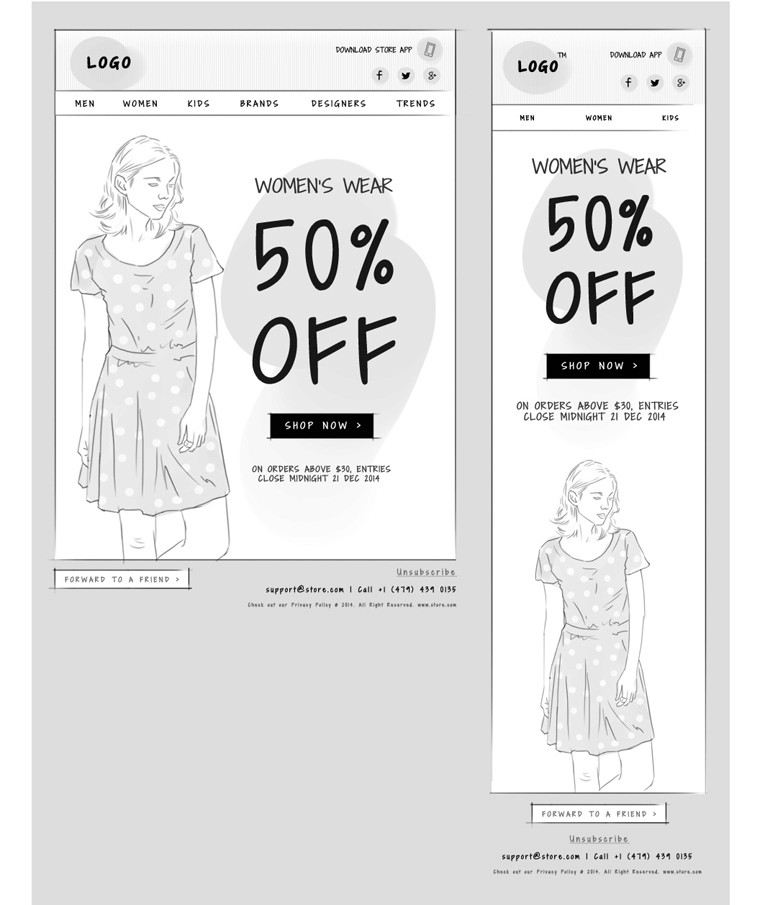
Very often, emails are read on mobile devices and any that don’t render correctly are likely to be ignored. Make your emails responsive. It’s a necessity, not a trend. Write short subject lines and make your text readable. Adequate spacing and larger button sizes will ensure people can tap accurately on links.
Link your cta to the right page
Sona
|
Marketing Email
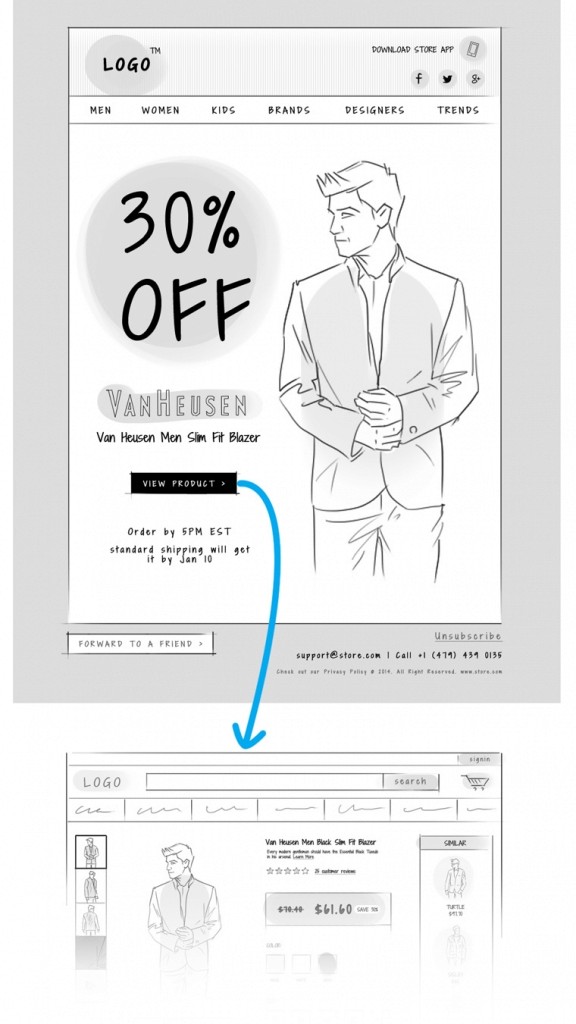
You risk losing customers if you don’t link your CTA to the right landing page. Don’t link your call to action to your homepage or a generic landing page and leave them to find their way to the right page on their own. Create landing pages that are highly relevant to your email communication and link your call to action to that page. If you are promoting a product in your email, land them on the appropriate product page where they can directly buy it.
Easy to find call to action
Sona
|
Marketing Email
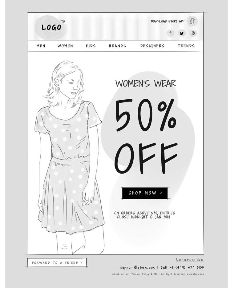
Include a single, prominent and appealing, primary call to action so your readers know exactly what you want them to do. If you are including social sharing buttons, remember each is a call to action as well. So, make sure your primary call to action is more prominent than the rest. If you do include a navigation bar, ensure it doesn’t take away people’s attention from the primary CTA.
Don’t hide your CTA in an image
Don’t stuff your emails with too many
Use a HTML based button for your primary call to action instead of plain links or graphic buttons
Place your call to action at the very top of the email, so that your readers don’t have to scroll through a lengthy email to get to it
Optimize for social media
Sona
|
Marketing Email
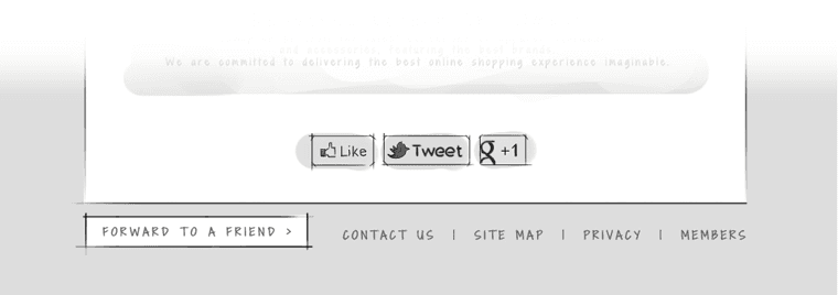
Include links in your emails that allow your readers to share them via social media. Make your social sharing buttons easy to find to increase the chances of your emails be seen by more people and driving engagement. When asking your subscribers to share your emails ensure they get something for their efforts and tell them that clearly. To help this along include a ‘Forward to Friends’ link.
Help recipients recognize your emails
Sona
|
Marketing Email
Help your recipients recognize your emails by using elements from your website that they associate with your brand; your logo, site colors and other design properties. Match the look and feel of your emails with that of your website.
