We are featured on Product Hunt!

We eagerly await your feedback.

E-commerce UX Design Playbook - Best UX practices for your eCommerce store | Product Hunt

We are featured on Product Hunt!

We eagerly await your feedback.

E-commerce UX Design Playbook - Best UX practices for your eCommerce store | Product Hunt

Checkout

+

Shopping Cart

-

Homepage

+

Product Page

+

Sitesearch

+

marketing

+

Holiday

+

SHOPPING CART DESIGN

Design ideas and usability tips for shopping cart page design. Glance through our design patterns on the full-page cart, mini cart, empty cart and so on.

Empty shopping cart design

Sona

|

Shopping Cart Design

When the shopping cart is empty, remind your users to add products to cart instead of just saying that it is empty. Provide shopping instructions and a call to action that entices users to do so. You can also include product recommendations or your store’s unique selling points.


Empty-shopping-cart ecommerce ux design

Mini shopping cart

Sona

|

Shopping Cart Design

Having a mini shopping cart is definitely not an alternative to the full page cart as decision making will be tedious with just a mini cart. It will help shoppers keep track of how much they spend and what they buy. Provide a link in the mini cart to view the full page cart instead of taking the user directly to checkout.
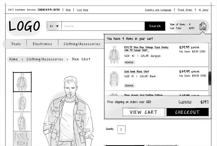

Mini-Shopping-Cart---2 ecommerce ux design


Use mini cart to confirm that a product has been added to cart. You can also include product recommendations which would make it easier for your shoppers to find more products.
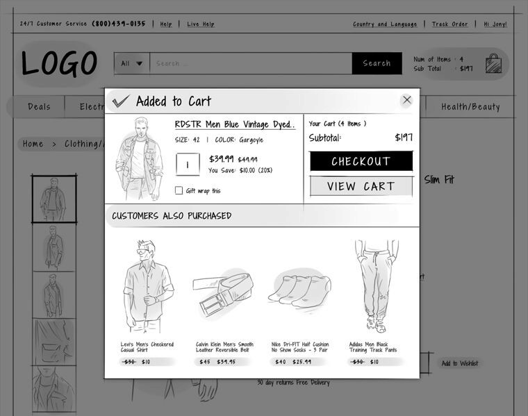

Mini-shopping-cart---1 ecommerce ux design

Full page cart

Sona

|

Shopping Cart Design

Users make their final purchase decisions when they are in the cart page. Shoppers add products to cart so that they can review or compare the items they have chosen, check whether the order total meets their budget or whether they qualify for free shipping etc. So, design your cart page in such a way that it assists your shoppers in their buying decision.
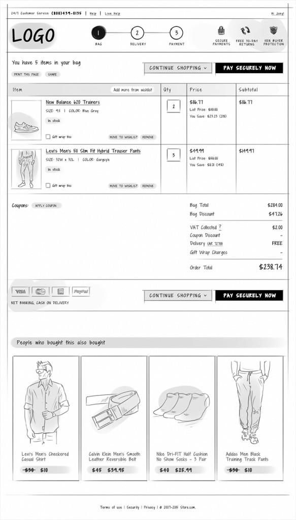
Full-page-shopping-cart-583x1024 ecommerce ux design

Where should the shopping cart icon be?

Sona

|

Shopping Cart Design

Allow your users to easily locate the shopping cart. Place the shopping cart icon on the top right of every page in your store. Indicate whether the cart contains products or not by specifying the total number of items. Also specify the total value of the items present in the cart.
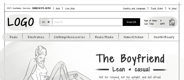
Cart ecommerce ux design

Sivi Gen-2 is an advanced AI design generator to effortlessly create stunning banners, social posts, and ads in over 72 languages. Transform your marketing with Sivi Gen-2 today!

Follow eCommerce UX Design on

Improve the shopping experience on your store with the best UX practices and tips.

Sivi Gen-2 is an advanced AI design generator to effortlessly create stunning banners, social posts, and ads in over 72 languages. Transform your marketing with Sivi Gen-2 today!

Follow eCommerce UX Design on

Improve the shopping experience on your store with the best UX practices and tips.

Sivi Gen-2 is an advanced AI design generator to effortlessly create stunning banners, social posts, and ads in over 72 languages. Transform your marketing with Sivi Gen-2 today!

Follow eCommerce UX Design on

Improve the shopping experience on your store with the best UX practices and tips.

Follow Ecommerce UX Design on

Follow eCommerce UX Design on Twitter
Follow eCommerce UX Design on Facebook
Follow eCommerce UX Design on Pinterest