PRODUCT PAGE IMAGES
Useful tips on product page design, to help you show off your product images on your eCommerce store. Glance through the list of design ideas and patterns below.
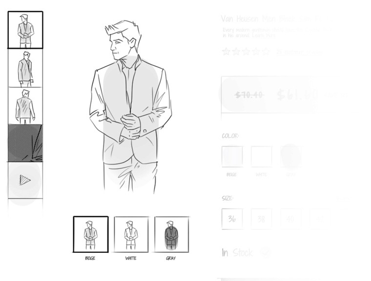
Images for every color
Sona
|
Product Page Images
If your product is available in multiple colors, have photos for each color so that your shoppers know what it will look like in the chosen color. When they see visuals of the exact product they are going to get, your shoppers will get a stronger sense for the product and will be more confident that they will get what they have in mind.

Show product in context
Sona
|
Product Page Images
Add context to your product. Merchandise shown in context are more memorable and will give a sense of how it will look like in the real world. Don’t sell your product. Sell the experience that your product offers. Showing the product in use will help the user get an idea of how it will look like in context or how it can be used. For example you can show clothing on people, a refrigerator stocked with food, how your furniture fit into a room etc.

Videos
Sona
|
Product Page Images
Product videos give a better idea of your product’s value, how it works and what it does in everyday life. If video make sense for your product, then it’s worth considering making one as it will help build shopper confidence in the product. Tell the story behind your product with videos and persuade your visitors to buy. Differentiate photos from videos by including a play button overlay on the video thumbnail image.

Zoom functionality
Sona
|
Product Page Images
Make use of the zoom functionality to highlight minute details of the product. The image should be clear even when it is zoomed. In-store, visitors can pick up a product and examine the material, finishing, texture etc. On eCommerce stores, the zoom functionality will give that experience the shopper to some extent by getting them close to your product. Zoom your image when the shopper hovers over any area of the product image or integrate click-to-zoom and enlarge images to full screen.

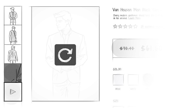
360 degree interactive image
Sona
|
Product Page Images
If you don’t want to clutter your product page with lots of images, then go for a 360 degree view as it will present your product from multiple angles and enable your shoppers to evaluate your product thoroughly. In-store, you can take a product, turn it around and inspect it. Use 360 degree view to bring that experience to your website. It shows the product in as much detail as possible in one shot. A product rotator is a good option if you cannot afford videos.

Textural images
Sona
|
Product Page Images
For some product categories such as apparel, getting an idea of what the product feels like is an important factor in making a purchase decision. Include an extreme close-up image so that they can see the texture as if they have the product in their hand.

Multiple images
Sona
|
Product Page Images
People want to know exactly what they are getting and a single product image can’t show all the important features of the product. Show your product in multiple angles so that your users can better visualize its details. The more the views, the better the experience. Display the back, front, sides and the interior of your merchandise to increase conversions and decrease returns.

Show what’s inside
Sona
|
Product Page Images
Show what’s on the inside rather than just explaining it in the description. This will also make it clear to the shopper that there is nothing hidden about the merchandise. For example you can show how many compartments there are in that handbag, how much storage space is available in the cabinet, what the make up kit looks like out of its packaging etc…

Create a sense of scale
Sona
|
Product Page Images
Providing product images and specifying the dimensions in the product description are not enough to determine the actual size of the product. Show your merchandise in proportional context, display your product next to everyday objects. Ensure the object you choose has a recognizable height or size, say a person.


