We are featured on Product Hunt!

We eagerly await your feedback.

E-commerce UX Design Playbook - Best UX practices for your eCommerce store | Product Hunt

We are featured on Product Hunt!

We eagerly await your feedback.

E-commerce UX Design Playbook - Best UX practices for your eCommerce store | Product Hunt

Checkout

+

Shopping Cart

+

Homepage

+

Product Page

+

Sitesearch

+

marketing

+

Holiday

+

Checkout Types

Things to take care when you opt for a single page checkout

Sona

|

Checkout Types
  • Data validation – Don’t wait until the user submits the form, validate and notify the user in real-time. Real-time inline validation will help your customers complete the checkout quickly with less effort and fewer errors. Make sure the notification is prominent enough that the user doesn’t skip it.
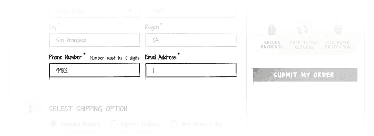

Checkout---inline-error-validation ecommerce ux design
  • Organize the checkout form – breakdown the checkout page into sections and keep the related items in close proximity.
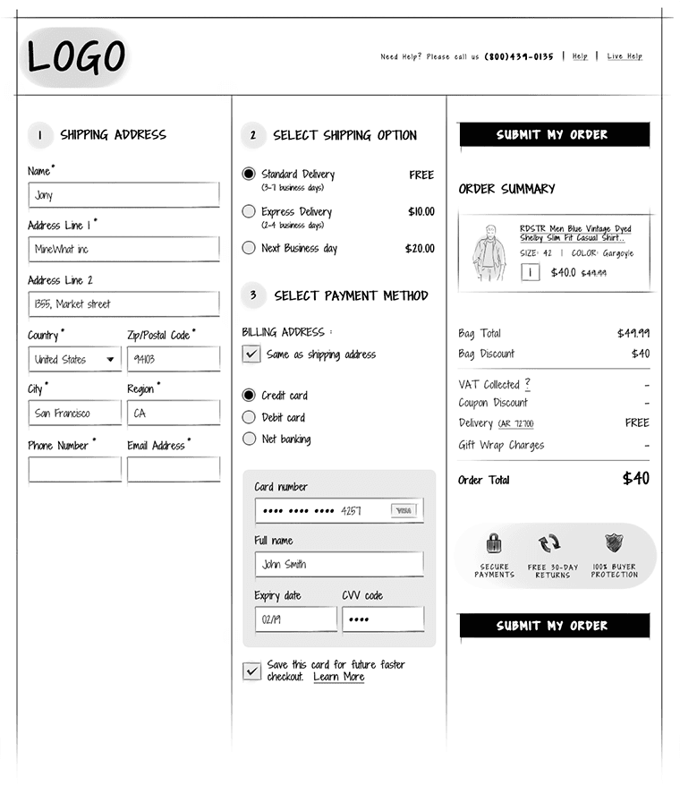
multi-column-one-page-checkout ecommerce ux design
  • Avoid asking unnecessary information – Single page checkout is meant to be quick and easy. So, avoid asking unnecessary information.

Shipping and billing addresses will be the same for majority of the orders. Pre-fill the billing address details with shipping address instead of asking the user to do a redundant job.


Checkout---Billing-address-same-as-shipping-checkbox ecommerce ux design


Show the zip code field and hide city and state. When the user inputs the zip code, expand the form with pre-filled city and state fields. Ensure these fields are editable.
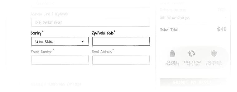
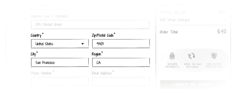
Checkout---Auto-fill-city-and-region-based-on-zip-code_1-2ecommerce ux design


Checkout---Auto-fill-city-and-region-based-on-zip-code_2 ecommerce ux design
  • Order summary in the right side area along with the call to action – pin this widget so that it follows the user when he scrolls down the checkout page.
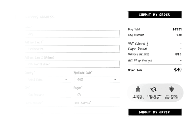
Single-page-checkout---pinned-order-summary-in-the-right-side ecommerce ux design


Sivi Gen-2 is an advanced AI design generator to effortlessly create stunning banners, social posts, and ads in over 72 languages. Transform your marketing with Sivi Gen-2 today!

Follow eCommerce UX Design on

Improve the shopping experience on your store with the best UX practices and tips.

Sivi Gen-2 is an advanced AI design generator to effortlessly create stunning banners, social posts, and ads in over 72 languages. Transform your marketing with Sivi Gen-2 today!

Follow eCommerce UX Design on

Improve the shopping experience on your store with the best UX practices and tips.

Sivi Gen-2 is an advanced AI design generator to effortlessly create stunning banners, social posts, and ads in over 72 languages. Transform your marketing with Sivi Gen-2 today!

Follow eCommerce UX Design on

Improve the shopping experience on your store with the best UX practices and tips.

Follow Ecommerce UX Design on

Follow eCommerce UX Design on Twitter
Follow eCommerce UX Design on Facebook
Follow eCommerce UX Design on Pinterest