We are featured on Product Hunt!

We eagerly await your feedback.

E-commerce UX Design Playbook - Best UX practices for your eCommerce store | Product Hunt

We are featured on Product Hunt!

We eagerly await your feedback.

E-commerce UX Design Playbook - Best UX practices for your eCommerce store | Product Hunt

Holiday Homepage Banner

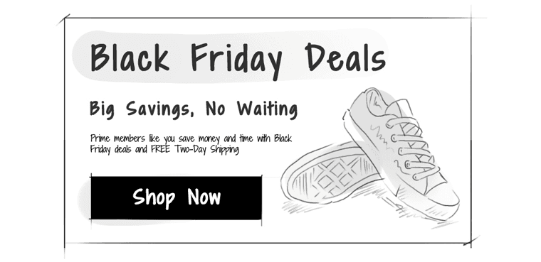
Include a clear Call to Action

Sona

|

Holiday Homepage Banner

This should be an essential part of your holiday banner. It should prompt users to click on it and clearly let your shoppers know what you want them to do. The best location for the cta is typically the right hand side of the banner (though its not critical). Get attention to your call to action by increasing the contrast or by giving it a festive theme.

clear-call-to-action ecommerce ux design

Follow Ecommerce UX Design on

Follow eCommerce UX Design on Twitter
Follow eCommerce UX Design on Facebook
Follow eCommerce UX Design on Pinterest