Improve the shopping experience on your eCommerce store with the best UX practices.
Get useful pointers on e-commerce user experience, tablet interfaces, mobile UX, responsive design, holiday banners, email design and more.
RECENT POSTS
Empty shopping cart design
Sona
|
Shopping Cart Design
When the shopping cart is empty, remind your users to add products to cart instead of just saying that it is empty. Provide shopping instructions and a call to action that entices users to do so. You can also include product recommendations or your store’s unique selling points.

Read more
Things to take care when you opt for a single page checkout
Sona
|
Checkout Types
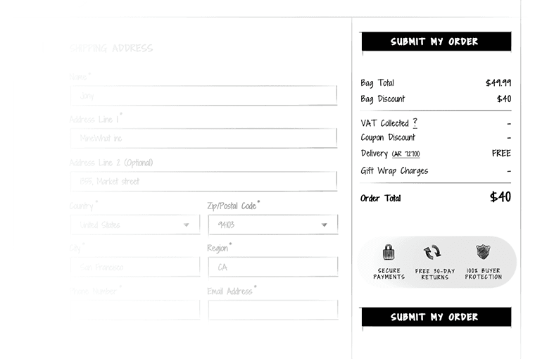
Data validation – Don’t wait until the user submits the form, validate and notify the user in real-time. Real-time inline validation will help your customers complete the checkout quickly with less effort and fewer errors. Make sure the notification is prominent enough that the user doesn’t skip it.
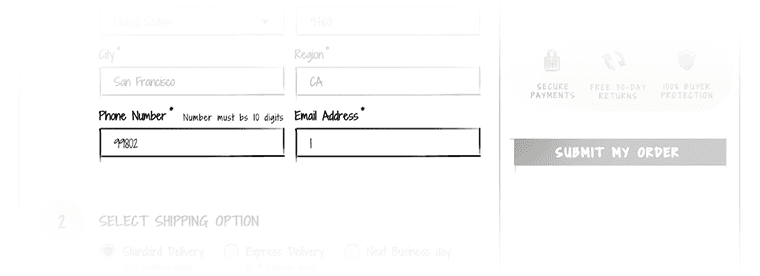
Organize the checkout form – breakdown the checkout page into sections and keep the related items in close proximity.
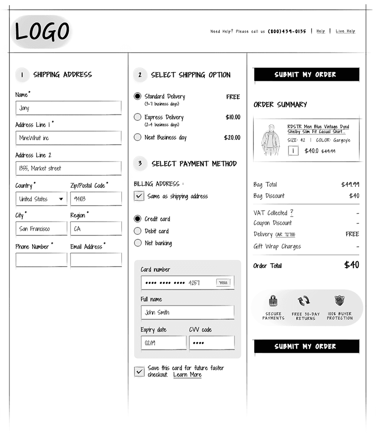
Avoid asking unnecessary information – Single page checkout is meant to be quick and easy. So, avoid asking unnecessary information.
Shipping and billing addresses will be the same for majority of the orders. Pre-fill the billing address details with shipping address instead of asking the user to do a redundant job.

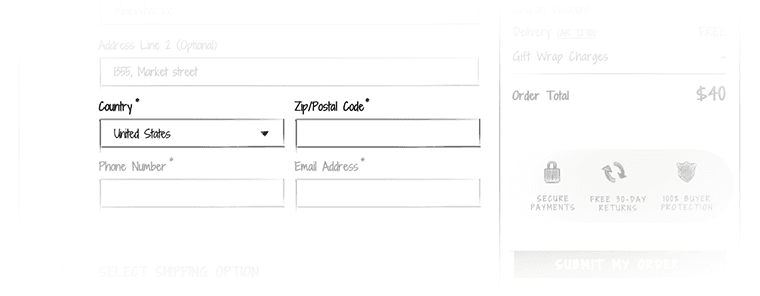
Show the zip code field and hide city and state. When the user inputs the zip code, expand the form with pre-filled city and state fields. Ensure these fields are editable.
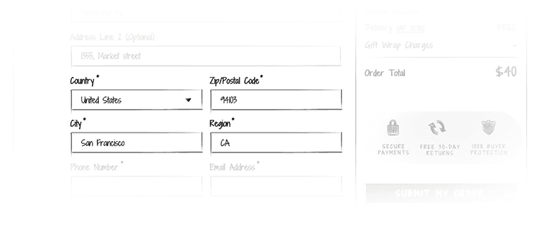
Order summary in the right side area along with the call to action – pin this widget so that it follows the user when he scrolls down the checkout page.
Read more
Single page checkout
Sona
|
Checkout Types
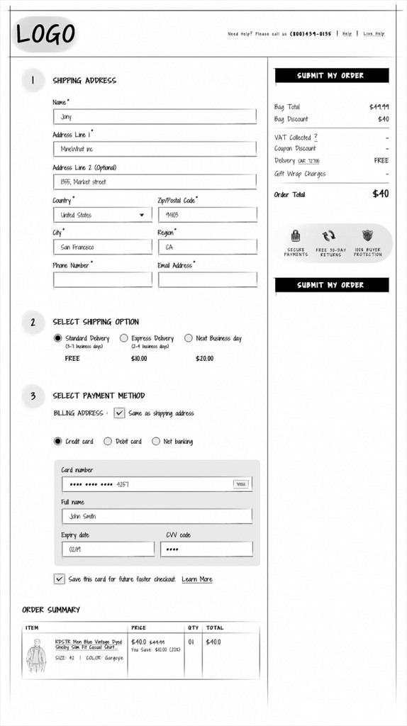
One-page or express checkout: As the name implies, shipping information, delivery information, billing and payment details will all be in one page for easy access and to make the checkout process as quick as possible. Customers need not go back and forth between the steps.
Read more
Checkout design
Sona
|
Checkout Types
Think of how you feel when you have to deal with a cashier in a brick-and-mortar store who takes a lot of time to bill your items or doesn’t know how to process your gift voucher. The more time it takes, the more frustrated you get. You are also far less likely to return. But in online stores, the more time it takes to complete the checkout, the more likely your shopper is to ABANDON the cart and less likely to return. So, design your checkout process in such a way that it is quick and easy to complete.
Many shoppers have concerns about payment security. Reassure your shoppers that their data is safe by displaying your security credentials, customer care number and link to privacy policy.
Don’t make your shoppers guess how many steps it takes to complete the checkout, keep them informed.
Any small increase in the percentage of users who complete the checkout would have a direct impact in your revenue. So, keep you shoppers focussed. Ensure your main menu, cross sells or upsells etc, doesn’t distract your shoppers from completing the checkout.
In short make your checkout process quick, easy, secure, informed and without any distractions.
Read more
Allow to print the cart content
Sona
|
Shopping Cart Add-Ons
Your shopper might buy for someone else or have to get the order approved by someone else. So make the approval process easier for them by providing an option to print or email the contents of the shopping cart.

Read more
Cross-sell/upsell
Sona
|
Shopping Cart Add-Ons
Use the shopping cart page to increase the cart size and the average order value by recommending personalized products or add-ons or simply sections such as customers who bought this also bought, top sellers or you might like. Test the placement, design, the products and the number of product suggestions shown.

Read more
Show different payment options
Sona
|
Shopping Cart Add-Ons
Shoppers might abandon their cart if their preferred payment method is not accepted by you. Offer multiple payment options and show the different payment options that you accept on the cart page as it will increase the chances of your customers continuing with checkout and in turn reduce cart abandonment.

Read more
Create urgency
Sona
|
Shopping Cart Add-Ons
You can reduce cart abandonment by creating urgency. Specify the number of units still available in stock if there are only few left. Or if you offer a deal on the products added to cart and that it ends in a day or two, then shout that out.


Read more
Persuade your shoppers with offers
Sona
|
Shopping Cart Add-Ons
When on the cart page, you can persuade your shoppers to add more products to the cart by offering something. Say, if you offer free shipping or discount on orders above a certain amount, then you can remind your shoppers of how much more they need to spend to get that offer.

Read more
What if shoppers buy gifts for someone else?
Sona
|
Shopping Cart Add-Ons
When possible add a gift wrapping option to purchases on your store and allow buyers to add a personal note to their gifts. Also, let the shopper choose whether or not to include the price information in the invoice during delivery.

Read more
Allow shoppers to save items for later
Sona
|
Shopping Cart Add-Ons
If an user feels that they cannot afford the total cost of their order, they might remove a few items from the cart. Provide an option to save or move those products to a wishlist so that they don’t lose track of it. You could also remind them of the products in the wishlist the next time one of them is on the cart page.

Read more
Let the shoppers easily remove items from cart
Sona
|
Shopping Cart Usability
Provide a clear text link to remove an item from cart and name it remove instead of delete. Also allow the user to set the quantity to zero to remove an item from cart. Once the user clicks the remove link, instead of removing the item immediately ask if the click was intentional.


Read more
Create branded visuals at the speed of your thought in 72+ global languages. Use Sivi AI Design Generator with its Large Design Model to create product banners, social posts, Google display ads, Facebook ads, Pinterest pins, Instagram posts, Amazon A+ banners, and more in just two minutes.
Improve the shopping experience on your store with the best UX practices and tips.


