SHOPPING CART ELEMENTS
Knowing the critical elements of a shopping cart is important for your eCommerce store. The design ideas listed here include checkout button, promo code option, shipping calculator, continue shopping button and so on.
Should you provide an option to calculate shipping in the cart page?
Sona
|
Shopping Cart Elements
If you ship to multiple countries or your shipping charges differ for different locations within the same country, then you definitely have to allow your customers to choose the shipping location or specify the zip code in the cart page so that they can calculate the shipping charges before proceeding to checkout. A simple pop-up that takes location input and a calculate button. If the user has already logged in, then fill the location with the default delivery address.

Promo code option
Sona
|
Shopping Cart Elements
If you offer something with a promo code, then allow the user to enter it in the cart page and check the order total with the applied code. Downplay the promo code section and make sure you link it with the promo listings.
You can use this section to grow your email list by specifying that promo codes are available to subscribers and when you do so remember to provide an option to opt-in for newsletter.

Trust and confidence factors
Sona
|
Shopping Cart Elements
Would a shopper trust you if they don’t know you well? Remind your customers that their information will be safe with you by including security certificates and privacy policy as security concerns would stop them from completing their purchase. Don’t forget to include links to shipping details, return policy and FAQ. Also, make them easy enough to find.

Provide an option to add more products to cart
Sona
|
Shopping Cart Elements
When on the cart page allow your customers to continue shopping. But don’t take them to a default page or homepage, let the shoppers choose where to go next. Provide a list of recently viewed pages to choose from. Instead of cluttering the cart page with a bunch of links, you can show them in a drop down when the user clicks continue shopping button. Including product recommendations in the cart page also provides way for the shoppers to continue shopping.

Checkout button
Sona
|
Shopping Cart Elements
This is the most important button on the cart page. Highlight it so it attracts attention. Keep meaningful text on the checkout button such as Pay securely now or Proceed to checkout etc instead of using contextual words such as continue. Place the primary CTA above the fold as well as below the order details.

Subtotal and final cost
Sona
|
Shopping Cart Elements
Before proceeding to checkout let the user know the total order cost. In the total include tax, packaging or shipping costs if any. Don’t hide any cost in the shopping cart. Also, shout out if you offer free shipping and specify the amount that the user has saved by buying from you.

Availability of the products in the cart
Sona
|
Shopping Cart Elements
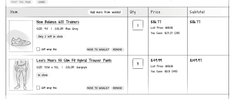
If a product goes out of stock after the user added it to cart, then specify that right on the cart page itself so that the user doesn’t have to end up paying for a product that is not available.

Summary of the products in the cart
Sona
|
Shopping Cart Elements
Provide the name of the product and a clear product image. Clicking on this should take the user to the appropriate product page.
Also, provide a brief description of the product along with info on the size and color selected which the shoppers can use to check if they’ve added the right product. Make sure the product image reflects the product options (such as color) chosen by the user.
Include the price of the products as well as the quantity chosen. If you offer a discount on the products in the cart, strike out the original price but still keep it visible. This will remind the shoppers of the great deal they are getting.


